Tomb Raider Underworld is the eighth installment in the Tomb Raider franchise and the third TR title developed by Crystal Dynamics. This was the first title that was built from the ground up for the Xbox 360 and Playstation 3 consoles. I joined the project shortly after the end of pre-production and I worked with Creative Director Eric Lindstrom as well as a number of producers and designers in shaping the overall design of the game's user interface.
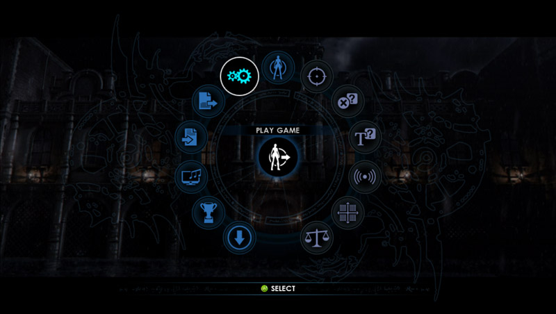
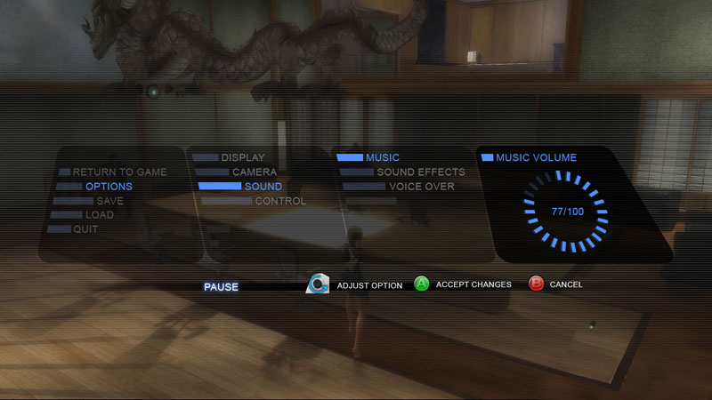
The overall UI design of Tomb Raider Underworld needed to appear modern, while still reflecting elements of ancient tombs and old world locations. Early on Eric Lindstrom had decided that he wanted a radial menu. I started with a basic circle shape that would fit all of the necessary UI elements on one screen. Eventually I incorporated design elements from high tech consumer goods and mixed that with the "Atlantean Ruins" that were being used thematically throughout the rest of the game.
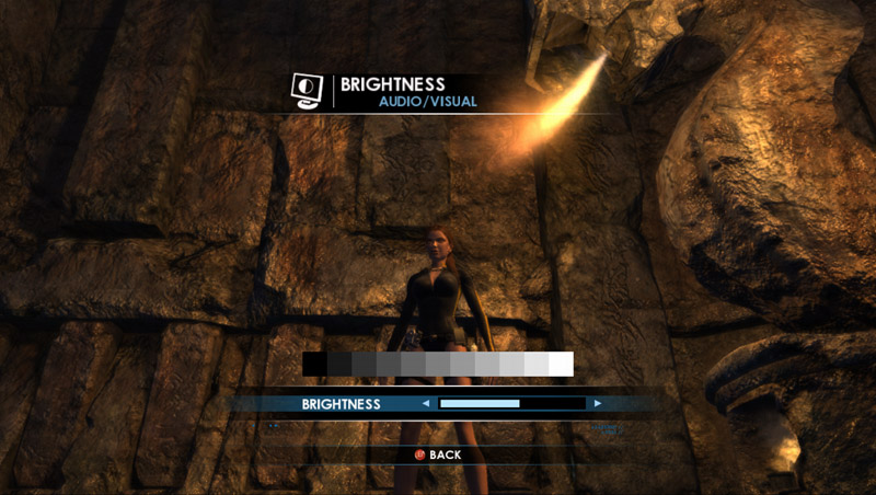
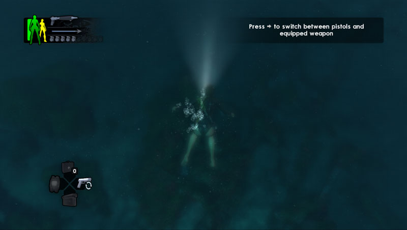
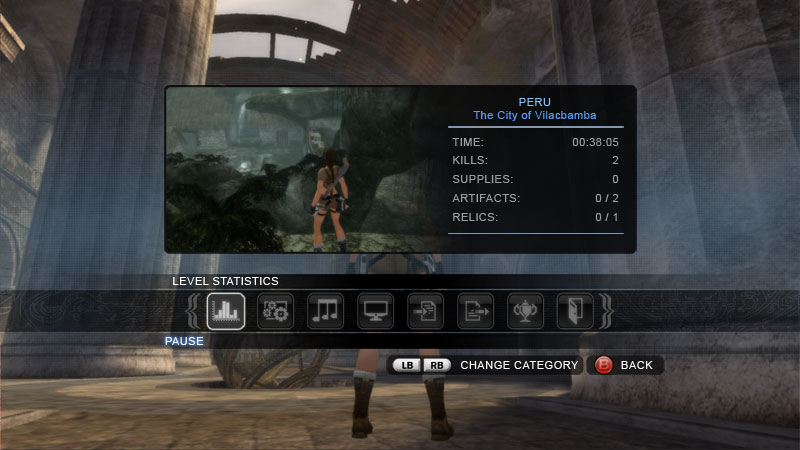
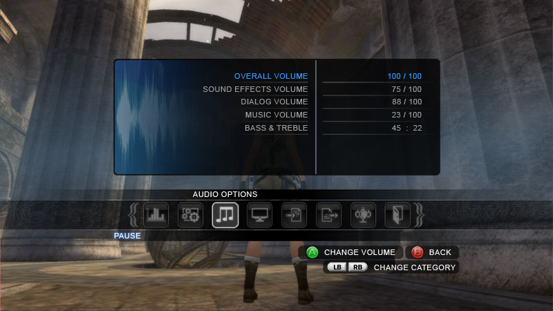
We focused on what was called "HUD-lite" for Underworld. In an attempt to keep the player emerged in the world, I created specific rules that kept the screen free of graphics whenever possible. The health and weapon pop-up was also segmented so that we could display different levels of information depending on Lara's situation. Our Creative Director was interested in creating a health indicator that was different than the previous Tomb Raider games so I worked up a silhouette graphic that changed color based on Lara's current health. There was also a vertical health bar that provided a more exact indication of Lara's health. Additionally, this bar solved an accessibility issue for color blind gamers.
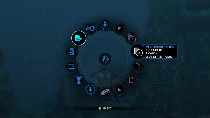
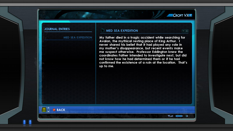
Lara's PDA became the home to a number of gameplay features that had nowhere else to live. This included level maps, journals, our hint system, weapon inventory and more. The PDA was designed as the only representational UI menu in the game, we wanted to give the impression that Lara was actually navigating this device that she carried with her.
Before the radial menu was decided upon, I created several design comps featuring more traditional horizontal and vertical layouts. In these early designs I tried to incorporate elements from modern interfaces, pulling reference from high end gadgets like digital watches, cell phones and stereos. The first three images show the beginnings of the category icons that would eventually be used in the final UI.